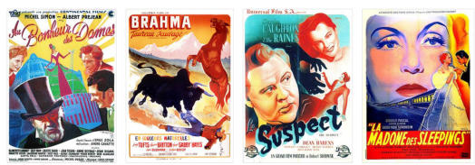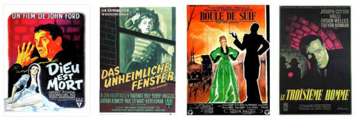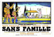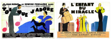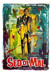
STARS ON ART
Copyright: Stars on Art


Rolf Goetze
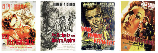
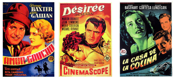
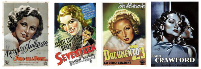
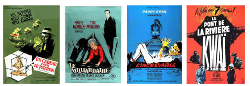
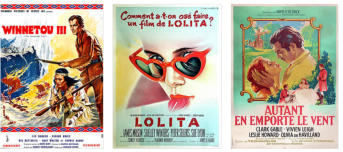
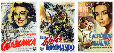
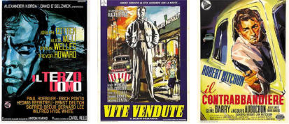
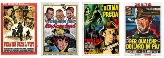
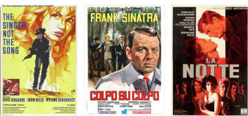
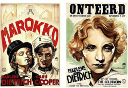
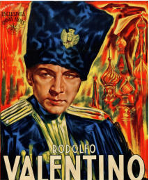
From a stylistic point of view, Goetze's posters are characterized by a great compositional structure; the German designer was capable of blending incredibly realistic, close-up portraits, with elaborate scenes in the background. An undisputed master of portraiture, Goetze created numerous posters using monochrome, black and white, or sepia palettes. His posters look like realistic, vivid charcoal drawings. They are able to represent faces and expressions of their protagonists, as mirrors faithful to reality.Osvaldo Mario Venturi
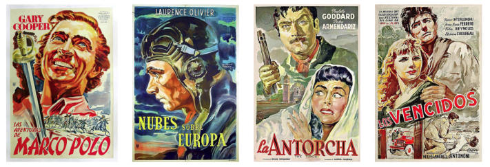
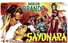
Venturi’s movie posters are characterized by a vivid chromatic palette and structured through the overlapping of veils: they seem bright watercolors. The representation of the protagonists' faces makes them unique. Venturi depicts their heads almost floating in a space rich of details, like in an intricate dream. His portraits are loud caricatures; they load emotions, gestures, attitudes, and almost exaggerated expressions. Influenced by the popular Argentinian genre of melodrama and its strong emotional power, a poster from Venturi is never cold or detached.Raymond Elseviers
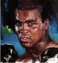
The brush strokes of Ray’s posters are inspired by the oil painting tradition, and they create sketchy touches of color, like in an Impressionist painting. Ray outlines the figures of the films' protagonists in the foreground, while landscapes and background scenes are achieved through imprecise dashes of color, in some cases even creating abstract compositions. Even the color palette used by the artist is extremely identifiable: different shades of pink and purple, yellows, reds, and greens characterize his artworks. Looking at Ray's posters is a bit like watching a movie when technicolor was invented: an explosion of color after years of black and white.Kurt Wenzel
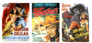
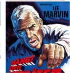
Kurt Wenzel’s posters all share an eye-catching graphic style: defined lines and shapes, refined typographical characters of the titles, high and accentuated contrast of lights and shadows. The outlines of his figures are always drawn with sharp lines, almost as if they were traditional etchings. In fact, like through ancient printmaking techniques, Wenzel obtains shapes with bold lines, fascinating for their simplicity and crispness. Wenzel’s artworks are characterized by an intense black component and a color palette in shades of gray and smoky colors. He also focuses on creative typography, frequently placing film titles at the top, like covers of an adventurous book.Constantin Belinsky
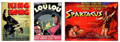
Belinsky’s style is particularly bright and attention-grabbing, thanks to a color palette with major yellow elements. Much attention is also paid to the typographic characters, creating particularly expressive titles and varying with other textual elements, such as names of actors, directors, film production companies. The result is a diverse miscellany of images and words. Unlike other movie posters, Belinsky's portraits are not particularly realistic, they do not want to faithfully represent the faces of the protagonists as if they were true. The designer is more focused in producing powerfull figures often depicted full length, accentuating poses, movements, and dynamism.Boris Grinsson
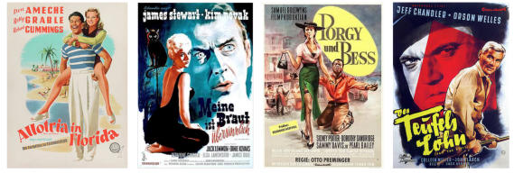
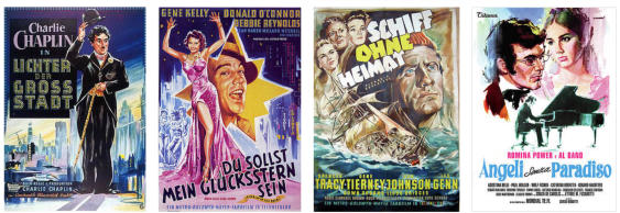
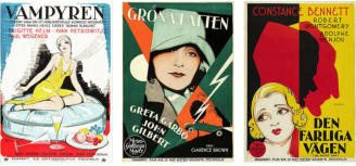
Grinsson’s painting style for posters is characterized by his peculiar treatment of colors. If compared with the style of Italian designers, for example, his portraits appear rather schematic. Rather than using strong contrasts between light and shadow, Grinsson modulated his figures with bold flat planes of colors and cool and defined outlines. His posters thereby often look like works of modern art, rather than traditional sketches. Even the color palette is rather restricted, preferring different shades of yellows, greens, blues. The chromatic and formal restriction of Grinsson’s style is not to be seen as a limitation, but as a legacy of the lithography technique that dominated German design until the early 1960s. A historical and peculiar element that distinguishes its very different and endless production.Clément Hurel
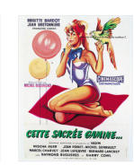
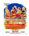
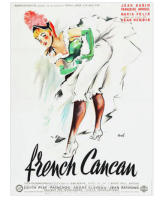
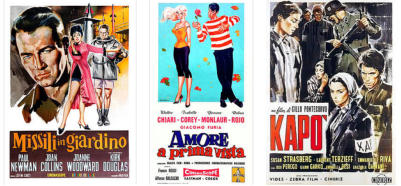
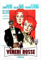
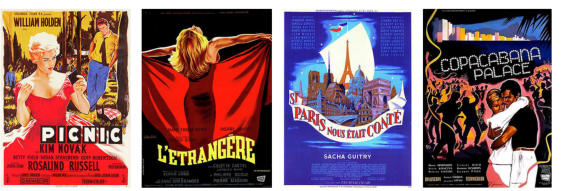
The style of Clément Hurel in his movie posters is unbelievably recognizable. Heavily influenced by his career in the advertising industry, Hurel creates posters with few but very striking characters in the foreground. He often plays with the playful sensuality of female figures typically inspired by the 1950s pin-up genre. The style is never realistic but rather caricatured, lighthearted, and humorous. From the point of view of colors, Hurel plays a lot on light tones, often juxtaposing black and white with cleverly colored elements. His figures even seem to be sketched as if they were pencil drawings or watercolors. Light and impalpable.George Kerfyser
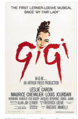
What immediately strikes the eye of the viewer when looking at George Kerfyser 's posters is the use of colors. The backgrounds are not crowded with scenes and characters but simple and essential. They are characterized by plain, campite, and uniformly spread colors. Blues, azures, greens, occasionally grays, and reds compose a mosaic of colors in wonderfully cool tones. The characters created by Kerfyser stand out against these colored backgrounds. They are often contrasting figures with marked outlines, black and evocative in their sometimes realistic, sometimes caricatured style. The modernity of Kerfyser's posters is palpable: they seem like amazing covers of contemporary graphic novels.Rene Peron
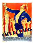
Rene Peron created posters that hardly go unnoticed, both in terms of color palette and composition. Incredibly balanced scenes, these works of art amaze for their bright colors, sharp contrasts, and bold titles. Peron’fs color selection explores the nuances of red, orange, pink, often creating contrasts between complementary colors. Blue stands out next to orange, yellow lights up, enhancing the overall picture. Even the style of the titles is made to attract attention: the designer works on typefaces, often dynamic, other times geometric, or powerfully contoured. Peron's posters are a mixture of realistic faces, more abstract elements, and flashy texts. A majestic balance of reality and poetry.Roger Soubie
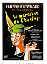
Roger Soubie has an enormous production of movie posters, some of which are highly celebrated. In this vast variety of genres, scenes, and characters, his style is always characterized by lively brushstrokes, attentive to tones, shadows, and transparencies. The skin of his actresses, their swathing dresses, look like shining silk designed by a Renaissance painter. The lines are realistic and traditional: the movie stars are depicted with their distinctive features, almost lifelike, but it is the composition that makes his design truly original. Soubie’fs protagonists are centered in the middle of the scene, sometimes they are inserted in frames or articulated between numerous words and titles with different fonts. Soubie’fs movie posters are dynamic. Like an engaging movie, always in motion.Klaus Dill
Klaus Dill 's posters are powerful, bold, and energetic. Influenced by his career as a western comics illustrator, his posters also absorbed this predominant strong and adventurous spirit. Dill's painting style is realistic in the depiction of faces, delineated with great attention to shading, lighting, and contrasts between dark and bright tones. However, it is the depiction of bodies that makes his work incredibly powerful: Dill paints plastic, three-dimensional volumes. He molds his characters as if they were sculptures. Under his shaping brushstrokes, actors and actresses take on physical substance.Josef Fenneker
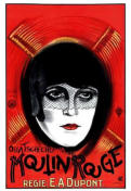
The posters of graphic artist, painter and set designer Josef Fenneker impress with their dark, mysterious and fascinating atmospheres. Stylistically, they embody the unusual and elegant forms of Art Nouveau but also the intense emotional energy of Expressionist painting. His characters, often haunting and spectral female figures, stand out against dark black orblue backgrounds. They are characterized by livid and gloomy tones. The restlessness of 1920s Berlin and the Weimer Republic shine through Fenneker’fs artworks. The artist masterfully used the technique of color lithography thus preferring the medium of printmaking. Lithography was a tradition in German culture and it allowed great expressive possibilities, enhancing contrasts and in the sharpness of outlines.Ercole Brini
Ercole Brini is a Roman poster artist active in the post-war period with an extremely personal taste. His movie posters are characterized by strong chromatic contrast, blacks and whites are opposed to each other, and particularly bright colors are juxtaposed with softer shades. Even the brushstrokes make his artworks particularly recognizable: the figures are often outlined through colors and not through rigid black outlines. The small touches of color are decisive, dense, and placed with each other. They create backgrounds, which make them look like impressionistic oil paintings.Alfredo Capitani
The peculiar signature of Alfredo Capitani in movie posters is among the most famous in the world of Italian design. The important experience with theaters, stages, and spotlights was essential to highlight his flashy but synthetic style. Extremely concise in delineating figures, Capitani is formally innovative. His lines are immediate and well-defined, like outlining concrete theatrical spaces. Even the impact of colors is intense and full of contrasts. Capitani’fs posters are a suggestive synthesis between forms and refined graphic lettering.Averardo Ciriello
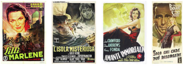
The faces portrayed by Averardo Ciriello look like powerful photographs. The realism of the expressions, the wrinkles and the crumples of the skin, the eloquent glances... everything in the posters of this artist appears alive and real. Ciriello realistically represents the moods and personalities of the protagonists of great films, often creating portraits of three-quarter faces. His primary skill lies in the ability to render lighter and darker areas, highlights, and shadows, while spontaneously modulating colors and tones. Ciriello is a master of chiaroscuro, capable of observing and, at the same time, letting people observe the peculiarities of the stars' faces, making them appear first of all as human beings.Rinaldo Geleng
There is something subtly somber and dreamlike in Rinaldo Geleng's posters, as if they were perturbing dreams. The impression is given by the use of colors: often dark, cold tones, he prefers black backgrounds and dull, livid greens. But that's not all, even the way Geleng depicts faces and expressions is often mysterious. The artist specializes in portraiture that appears to be painted in tempera. However, the realistic features are accompanied by the influence of expressionist painting. The colors in some posters become exaggerated and unnatural, strongly expressive. The reality is overcome by a more emotional world, made of more hidden feelings and undertones.Jean-Claude Ghirardi
The style of Jean-Claude Ghirardi's movie posters is characterized by an original and distinctive dissonance. For colors, the cold tones of purple and bluish are juxtaposed with warm colors such as red, yellow, and orange. It creates a particular effect of contrapositions. The same contrast in style: Ghirardi realizes compositions where incredibly realistic portraits coexist with more sketchy and abstract backgrounds and scenes, almost splashes of color. Moreover, the use in some cases of sepia tones makes the artist's portraits look almost like traditional sketches or charcoals inserted into colorful and innovative contexts.Joseph Koutachy
It is impossible not to be fascinated by Joseph Koutachy's compositions: dynamic, essential while maintaining their harmony. The painted faces are geometric and angular, while the chiaroscuro of shadow and light on the skin create almost solid forms. Even the setting of the composition is schematic: the space is divided by squares, sheets, curved lines that split and animate the scenes. When looking at a Koutachy poster, it seems like looking at a Futurist painting. He shares with the Avant-Garde art of Futurism the ability to render velocity and movement, even with geometric forms. While the power of strong energy is achieved with static forms.Hans Braun
The sensuality of the female figures portrayed by the designer Hans Braun is extremely physical. The charm of these movie stars passes through the artist’fs talent, able to make their bodies defined and almost sculptural. The tones and colors are strong: intense reds, blacks, and purples. Even the rendering of faces and expressions makes them idealized but at the same time beauties in flesh and blood. Braun delineates the figures with marked black outlines, embossing them on neutral and chromatic backgrounds as if they were sculptures. In this way, the protagonists stand out on the scene, impossible to look away from them.Heinz Schulz-Neudamm
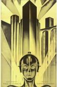
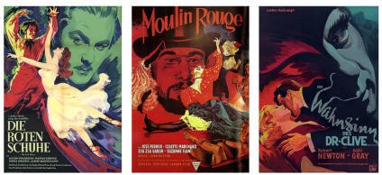
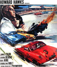
Heinz Schulz-Neudamm's style is unmistakable and popular, due to the fame of some of his movie posters, first and foremost the avant- garde Fritz Lang's Metropolis. His portraits are realistic and, at the same time graphic novel-like, thanks to the unnatural but intense use of colors. He does not use a methodical modulation of tones or chiaroscuro: the colors are plain, defined, without smudging. The effect is precise, the balance between flashy titles and elegant scenes is impeccable. Even the famous poster of Metropolis, a veritable tribute to New York, is a lithograph that expresses a look towards the future. The great buildings of the city shine with a luminous and electric tension, reminiscent of the energetic cities represented by the Futurists and of the exasperated forms of German Expressionism.Bruno Rehak
Bruno Rehak's style in his movie posters is variegated and eclectic, capable of combining different influences and attitudes. During his career, Rehak created posters with a hyper-realistic style, extremely detailed portraits, and others more similar to vignettes and caricatures. He pays enormous attention to the representation of emotions and feelings in the faces of the protagonists, making his work particularly expressive. Rehak also created titles with appealing graphics. They were capable of restoring, with typography, the mood of the cinematographic masterpiece they advertised.Georg Schubert
In a unique glance, Georg Schubert captures perhaps the most fascinating aspect of cinema: magic. Like those captured by the movie camera, the worlds he creates in his movie posters are sparkling and dreamy. The cold and pastel chromatic tones give the entire atmosphere a romantic and delicate allure. The use of a particular shade of blue tending to indigo makes his background almost crystal clear. Created with touches of color particularly focused on the bright use of white, his characters shine as if under the spotlight.Hans Otto Wendt
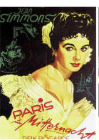
Like charcoal sketches from another era, Wendt's movie posters attract viewers with their traditional beauty. The narrow color palette used by the artist is never a limitation. Tones of brown, gray, and terracotta lend a vintage charm to his compositions. However, the most remarkable strength is the extraordinary portraiture. Wendt is a true expert in portraits and human faces. Incredibly realistic, his sepia portraits almost look like photographs from the past, carrying a tinge of true nostalgia from that golden age of cinema.Manfredo Acerbo
Manfredo Acerbo told what he absorbed while living in the city of Rome for a long time: his movie posters are often imbued with decadent love and romance. His compositions are characterized by going beyond the simple portrait. The characters are placed in complex settings and perform staged actions. Acerbo is a creative and conscious interpreter of reality; he tells different human types and their emotions and acts. The style is expressionistic for the use of violent, accentuated, sometimes unnatural colors. In those years, moreover, Acerbo also experienced the influence of the Italian Neo-Cubism current, introjecting the essentiality of the line and the synthetic and narrative quality.Dante Manno
What is striking about Manno’fs posters is the imposing presence of reality. He portrays the movie stars paying incredible attention to their volumes, to the tonal research of colors to create relief, to the areas of light and shadow. The result is extremely three-dimensional, modeled, plastic designs. Manno works on light and on the thickening of the contour line, giving depth to his figures skillfully placed in space. As a result, he creates bodies that seem real and dynamic.Jose Montalban
Jose Montalban navigates through different styles, creating a kaleidoscope of settings and characters with mixed moods. The result is a varied corpus of works that communicates the richness and dynamism of the whole world of cinema. Some posters have truthful traits, while others are sketched and impressionistic. He creates animated-like scenes while others include expressionistic and disturbing atmospheres from their geometric essence. Montalban's talent is in masterfully adapting his style, which fits like a glove with the selected motion picture.Jacques Bonneaud
Jacques Bonneaud's posters are striking for their colors and compositional structure. The subjects are often placed on unexpected and surprising lines: they are arranged on diagonals, asymmetrical lines, dynamic directions. Some faces stand out in the foreground, other characters move with dynamic actions in the background. The portraits are realistic but at the same time essential, graphically uniform, with defined lines. They are very recognizable actors and actresses, but never painted in a veristic way. Bonneaud's artworks highlight the protagonists also through the use of colors: bright, unnatural, while watching them, it seems to be in front of a Fauvist painting.Bernard Lancy
Bernard Lancy turns poster movies into advertising masterpieces. His works are completely different from the realism and truthfulness of many colleagues; they incorporate caricature, geometries, patterns, and colorful drawing. The originality of this designer's style lies in his ability to integrate various languages, creating mixed compositions, sometimes loud in their integration of characters, texts, frames, and colors. Lancy keeps himself in joyful balance, moving between different elements.Jean-Adrien Mercier
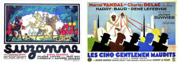
Jean-Adrien Mercier's style is recognizable like a few others for its originality and formal purity. His images are almost always created with geometric shapes, stylized as if they were outlines, cut-outs of a more complex picture. Because of their regular geometry, they almost look like images from the design of Russian Constructivism or schematic but flashy artworks of Second Futurism. The French artist uses primary colors -yellow, blue, red, but also white and black fields- on neutral backgrounds. There is order, cleanliness, essentiality. Mercier communicates in the most effective way possible: through disarming simplicity.Heinz Bonne
Heinz Bonne creates posters that blend precision and sketch, reality and imagination. His characters look like realistic portrait drafts, carefully drawn against backgrounds of pure color. Quick, impressionistic watercolor touches, as if trying to find the perfect color on the palette. In reality, the colors chosen by the artist are extremely coordinated with the figures in the foreground: reds, browns, greens, are repeated in the backgrounds and in the sometimes-monochromatic choice of the protagonists. Bonne creates careful posters, even in the use of light and tonality. However, he makes them appear light and spontaneous as if they were created effortlessly.Boris Streimann
It's hard to remain indifferent to the haunting charm of Boris Streinmann's movie posters. Accomplice to a color palette of dark tones, characterized by deep reds, greens, and grayish blues, his posters appear mysterious and intriguing. The portraits are extremely expressive close-ups that almost look like cinematic flashbacks of the main scene. The compositions, made with fine brushwork and hand-brushed lettering, are always arranged on two temporal planes. Streinmann's achievement is an atmosphere of gloomy but never confusing hues.Rodolfo Gasparri
Rodolfo Gasparri's artworks are perfect in their balanced traditionalism. The Italian designer and actor is authentically a figurative painter, who put his pictorial talent at the service of the cinema world. His movie posters are indebted to his career as an illustrator of crime book covers -just observe his yellow, glaring, titles! - and photocomics: they look like animated and narrative photographs. His portraits focus on facial details, wrinkles, and the folds of the face of the protagonists. Gasparri thus gives the viewer a vast repertoire of expressions and looks, all different and distinctive.Giuliano Nistri
Giuliano Nistri shows in his designs how it is possible to coordinate order and dynamism in the same artwork. His compositions are extremely schematic, often scenes and characters are placed in structured rectangular bands, with the vertical or horizontal orientation that materially divides the space. This expedient gives effectiveness and clarity of reading but does not miss the movement. The static nature of Nistri’fs art is only apparent. His figures are dynamic thanks to changes in posture and facial expressions. The sometimes- monochrome portraits highlight different expressions, halfway between caricature and illustration. Some of his movie posters look almost like the covers of detective books because of the composition, even though they do not deal with genre films. Giuliano Nistri’fs paintings are like curtains, opening onto a theatrical scene.Sandro Symeoni
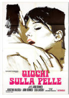
Sandro Symeoni's imagination is fervid and his production immense. The designer creates samples, sketches, different versions of the same movie poster, offering various alternatives to clients and a kaleidoscope of different styles. Symeoni passes with extreme naturalness from the realistic style of the Fifties to the caricatural and almost abstract style of the Seventies, he moves from the accurate stroke to the more impressionistic and sketchier one. He applies the same imaginative eclecticism in the lettering of the titles, which adapt to the style of the film: sometimes playful, in other cases geometric and constructivist, or with typefaces reminiscent of the colorful Beat Generation. Symeoni's posters are experimental and bold, with figures often realized only with the use of. He combines great pictorial talent, graphic synthesis, and photograms of scenes he imagined as if they were expansions of the movie.Dolly Rudeman
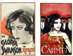
Dolly Rudeman is the queen of movie poster design of the 1920s, the only woman in a male-dominated world. The Dutch artist offered the public infinite shades of femininity, through the faces and glances of great actresses. In her artworks, there is no longer merely the sensual beauty highlighted by her other illustrious colleagues, but also the strength, the icy and melancholic gaze, the rebellious and determined attitude of the women of her era. Her style is bold, austere, almost futuristic. She uses geometric shapes and a black and decisive stroke. The color palette is limited to red backgrounds, white, with female faces in the foreground. Looking at her movie posters it seems to be in front of the Art Deco work of the painter Tamara de Lempicka, for the same clear use of lines and bright colors. In the art of Dolly Rudeman there is the reflection of all the modernity of the 20s, the unconventionality of female emancipation at the dawn of time.
Eric Rohman
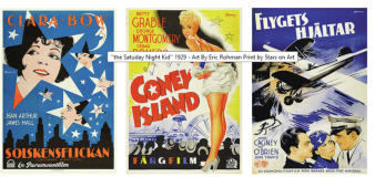
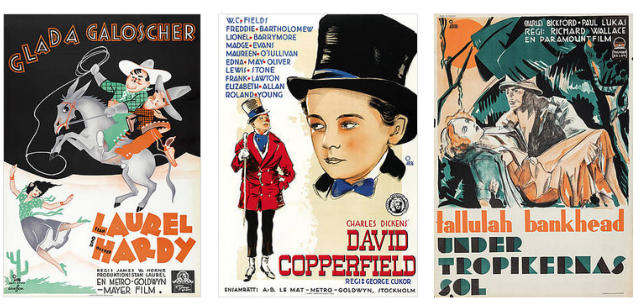
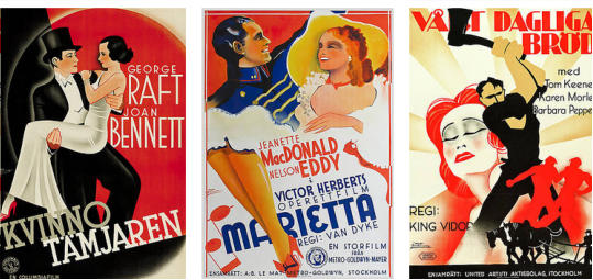
The crisp and essential style of Eric Rohman is striking in his movie posters. His traits are well outlined and sharp and give life to the characters; he uses few colors and is never too loud, he has a great originality in managing the composition and the construction of space. The Swedish artist creates movie posters that are caricatured and powerful in the representation, with high graphic settings. He depicts essential backgrounds of cities, apartment interiors, airplanes, bars, or simple backgrounds with geometric patterns. Rohman's posters attract the audience's attention creating curious scenes, geometric and coherent in the narrative but never static. That never gets boring.Guy Gérard Noël
There is in Guy Gérard Noël 's movie posters a special emphasis on shapes and contours. His scenes unravel in mixed ways: sometimes they are neatly placed in borders and frames, in other cases, they move along curved lines, obtained through the arrangement of titles, banners, and other graphic devices. Noël outlines the characters by combining his realistic portraits with precise, sharp contour lines. The French designer's posters are also characterized by the frequent use of black silhouettes: character profiles, trees, and cliffs come to life through their mere shape and shadows. Noel posters manage to communicate the mystery and desire to discover the unknown, in the darkness of the movie theater.Roger Jacquier
The energy of Roger Jacquier, better known by the pseudonym Rojac, is palpable in his movie posters. The French illustrator creates a mixture of styles, drawing both from reality and from more rarefied atmospheres, from sur-reality. Rojac is a purist in the veristic representation of faces and characters, but his compositions unhinge the sense of reality in a dynamic way. Strong outlines, bold colors, juxtapositions of cold and warm hues, and complementary colors such as orange and blue, create animated and fast-paced scenarios. His compositions are characterized by scenes within scenes, intersecting elements, making Rojac's approach to design and filmmaking complex magic.Vanni Tealdi
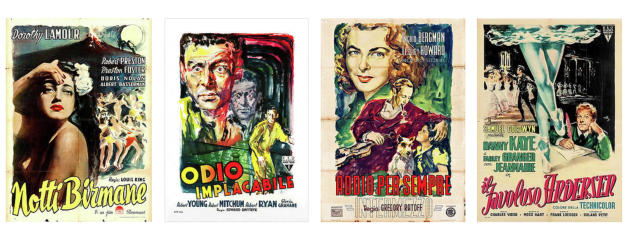
Vanni Tealdi approaches the world of movie posters and film paintings by rediscovering traditional styles. As it happens in the European art of the Eighties, the revival of tradition, quotations, of literal representation becomes more and more frequent and ambitious. Tealdi's portraits are characterized by great realism and scrupulous attention to detail. The designer uses color to accurately render the range of nuances and works with light and shadow to create realistic chiaroscuro and effects; he modulates the volumes of characters and settings. A poster by Tealdi truly recreates the atmosphere of the golden age of cinema.Tino Avelli
Tino Avelli treats movie posters as if they were impressionist paintings, with the same eye for light, brilliant rendering of color, and poetry. The touches of color that outline the figures are delicate, harmonious, and full of light. The designer makes masterful use of white: brilliant, he uses it both in the backgrounds and to give light to the skin and faces. He defines and models his characters through the sole use of color; some of the faces he creates look like splendid Renoir portraits. Avelli beautifully captures impressions, not reality.Silvano "Nano" Campeggi
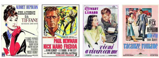
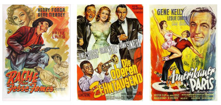
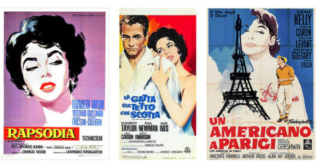
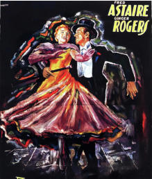
Silvano Campeggi also nicknamed as 'nano' has a unique style characterized by a sharp simplicity. The line of his drawings is distinct and thick, with few colors and elements. This essentiality is not an obstacle, it led the designer to create endless scenarios and combinations. The style is vaguely reminiscent of Japanese prints and etchings: there is the same pursuit of cleanliness, balance, and graphic directness. Campeggi in some movie posters even reaches the conceptual style, choosing for the representation of the film justiconic objects, a face, an expression, a title. There is truly essential modernity in Campeggi's posters.Mauro Colizzi
Mauro Colizzi has a style indebted to the great portrait tradition, which reaches peaks of realism through monochrome and sepia tones. His movie posters are literally photographic paintings. The artist focuses on lights, shadows, and expressions. He works on the titles, characterized by red or yellow to attract attention and clear and balanced typefaces. The text is uniform, giving prominence to the actors', actresses', and cast's names as if he were painting the film's end credits. Colizzi's scenes are often outlined in orderly frames. They are composed and balanced as if they were inside a cinema screen.Enrico De Seta
During his career, Enrico De Seta designed more than a thousand movie posters, giving the public and movie lovers a panorama of very different styles and moods. With a career as a cartoonist behind him, this poster artist represented characters in a realistic style but also caricatures in a satirical vein. The caricature exaggerates the features of the protagonists while maintaining, in substance, the distinctive lines of the portrait. De Seta embodies the widest spectrum of emotions: irony and hilarity, lightness, playful sensuality, but he also realizes strong artworks which attract attention through the combination of contrasting colors.Paolo Tarquini
The style of Paolo Tarquini ’fs movie poster seems to be that of a post-impressionist painter: the great freedom in the use of color is evident. The choice of tones is always original, the touches of color vibrant, almost as if light and color were something mobile, iridescent, transformative. Even the textiles of the clothes of the characters seem to take shape and movement through the iridescent combinations of color. The backgrounds of this designer seem to be fluid and mutating. Everything in Tarquini's posters tells a story about transformation, fluidity, and fantasy. He absorbs the most magical quality of cinema art: that of giving movement to static images, creating a surreal world of escape from reality.Gosta Aberg
The Swedish designer Gosta Aberg creates incredibly modern conceptual graphic artworks. The faces of the movie stars are no longer the main protagonists of the composition, but often objects or distinctive scenes. The style is linear, geometric, essential. Aberg creates extremely symbolic compositions, consisting of evocative elements but delineated in a precise manner. His works are characterized by simplicity and stylization. The objects are made uniform and simplified, giving the viewer a feeling of order and comprehensibility. Aberg is a refined interpreter of the world of cinema, which tends to make complex worlds immediate and clear.John Mauritz "Moje" Aslund
John Mauritz Aslund also known as Moje, is the king of colorful and linear images. He outlines faces and characters as if they were stencils, simplified and decorative silhouettes. The artist manages to convey emotions and expressions through geometric shapes, flat colors and defined lines, preferring primary colors: reds, yellows, blues, and uniform black and white tones. Even the texts and typefaces become essential and original elements of the composition, adapting to the painted scenes. Aslund paints with simplicity, creating artworks characterized by shapes and their relationships.Enrique Mataix
Enrique Mataix 's movie posters are perfect arrangements. Their design shows great originality in the composition, creating connections between images, frames, and titles. Characters often blend together or adapt to the scene, taking on different postures, settings, and sizes. They express a very dynamic patchwork effect. However, Mataix never loses the thread in this animated flow. Everything is graphically connected, held together by a masterful coherence.Mac - Macario Quibus
Macario Quibus , also known by the nickname of Mac, is an artist with two faces. Some works are strongly expressive and dramatic, others lighter and luminous. There are movies posters characterized by vigorous brushstrokes, chiaroscuro effects, dark palettes, and almost Caravaggio-like lighting; others are extremely graphic, linear, schematic, characterized by the dazzling use of white color. The art of Quibus is a painting style based on lights and shadows, which goes beyond the conformist standards of design to achieve great expressive power. ·Estudio MCP
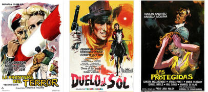
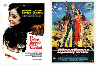
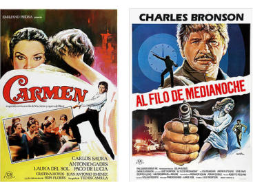
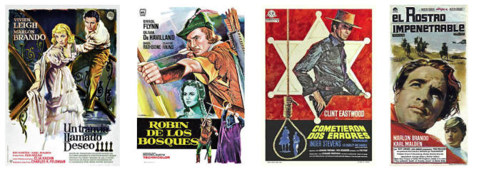
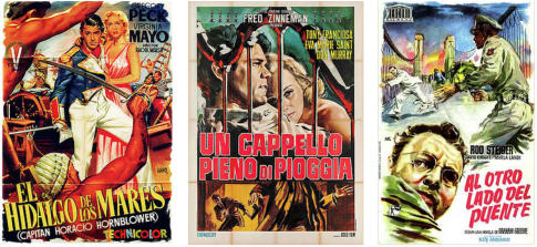
The trio of artists and graphic designers MCP has strongly influenced the style of movie posters and the tradition of film imagery in Spain. Artists Ramon Marti, Josep Clave, and Hernan Pico specialized in producing posters for American and European films, making their style unmistakable. Despite the natural differences in their workmanship, the MCP fine art company maintains a certain uniformity of intentionality and graphics in the panorama. The artworks are all characterized by a great compositional clearness: uniform colors, thick and marked lines, and realistic brushstrokes. The space is filled with harmony, ensuring the balance between solids and voids. MCP's posters are, moreover, underlined by a palette of recurrent colors: light blues, greens, yellows, and pastel shades, making them sophisticated and appealing objects. ·Josep Soligo
· Imagine Josep Soligo 's posters spread across the city walls: impossible not to notice them. Colorful, expressionistic, and free from dogmatic schemes, his artworks often have anti-naturalistic colors that attract attention. The faces of movie stars often have red, orange, bright yellow, even green tones, creating a very striking monochrome. If in Soligo's work the chromatic choices are free and unconventional, his representation and use of line are strictly linked to a realistic and almost photographic style. We can perceive in his posters a strong dissonance between the world of color - imaginative, brilliant - and that of the portrait, anchored in reality. Soligo's painting is a painting of chromatic contrasts, juxtaposition of complementary colors, warm and cold tones that echo each other, but always remain faithful to the real world.Jano (Francisco Fernandez Zarza)
The large number of artworks created by Francisco Fernando Zarza, known as Jano, makes it complex to define the unitary aspects of his style. Lively, dynamic, and with intricate compositions, Jano is one of the favorite designers in the panorama of Spanish cinema. He created movie posters that are realistic and photographic and others more caricatured; he realized sensual female portraits but also conceptual images, characterized by few elements and characters. What strikes you when you look at one of his works is the feeling of movement, dynamism, the vitality of his compositions. Scenes, settings, and protagonists fit together following different directives and vanishing points. The chaos of elements and colors makes Jano's posters a loud set of faces. But in this chaos, there is life, true action.Sergio Gargiulo
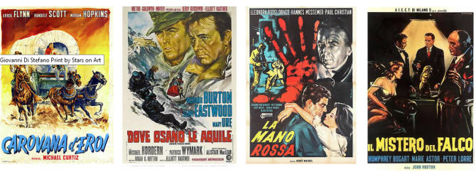
Sergio Gargiulo's art has an extremely personal and recognizable style. The focus of the designer, in fact, falls precisely on faces: there is no setting or scenery; gazes and facial expressions are enough to connote the story. The focus of this artist is on portraits and the plot becomes secondary, preferring a simple and minimal graphic composition. In this stylistic choice, Gargiulo favors clean, graphic lines and the use of iridescent and bright colors to create luminous effects on the face. The movie stars occupy the space entirely, carving out a space in fanciful spots, clouds, or squares. In some cases, Gargiulo chooses interesting monochrome shades of gray or shades of bronze, giving the characters the noble status of sculpture. Gargiulo's artworks are sculptural portraits. ·Di Stefano
Di Stefano is an artist whose movie posters reflect the great tradition of hyperrealist design. His faces -photographic, skillfully represented with light and shadow, sometimes monochrome- look like precise charcoals, so faithful to reality. However, the originality of this artist lies in his compositions: the realism of the portraits is combined with scenarios and more evocative elements. Even the titles stand out for their particularity with chromatic contrasts often accentuated by the preponderant use of black. Di Stefano's works play with color, defined through suggestive combinations.